Gas Station App
A mobile application designed during an internship project with the goal of enabling quick and convenient fuel and charging payments. The app was envisioned as a central tool for drivers, combining core payment functionality with additional features that support everyday travel and longer journeys.
Problem
Many existing gas station applications either offer very limited functionality or become overly complex, making them useful only for a narrow group of users. In such cases, the core purpose of the app, enabling fast and simple fuel payments, is often lost. The key challenge was to find the right balance between offering valuable features and maintaining a clear, intuitive experience accessible to a wide audience.
My role and responsibilities
As one of the UX/UI designers on the project, I was responsible for gathering initial requirements and understanding the internal client’s vision for the application. I conducted competitor analysis to identify relevant features and gaps in existing solutions, and collaborated with the client to define the final product vision.
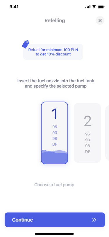
My responsibilities also included creating the information architecture, defining user flows, and designing the initial screens using the company design system. Where needed, I designed custom components to support unique features. I built an interactive prototype to present the solution and incorporated feedback before preparing the final mockups and files for design handoff.
Process
The project started with discussions with the internal client to understand expectations and business goals. This was followed by competitor analysis to explore common patterns and identify opportunities for improvement. Based on these insights, the product vision was refined collaboratively.
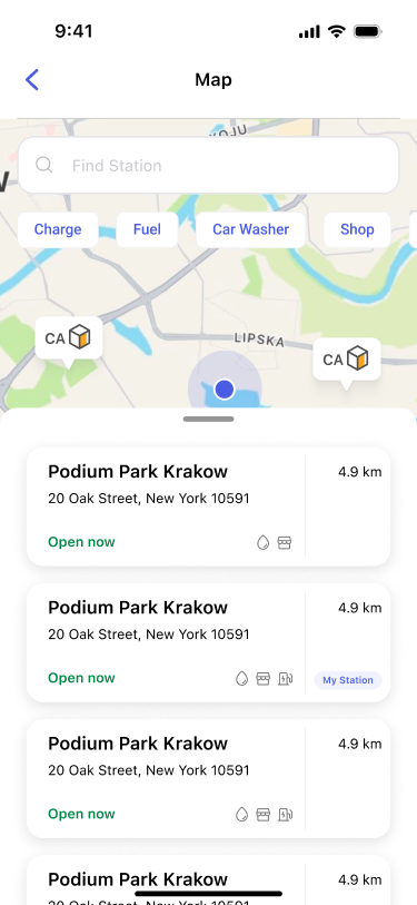
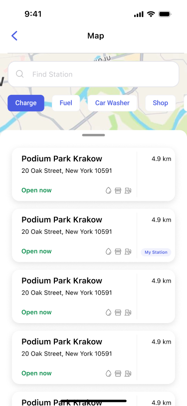
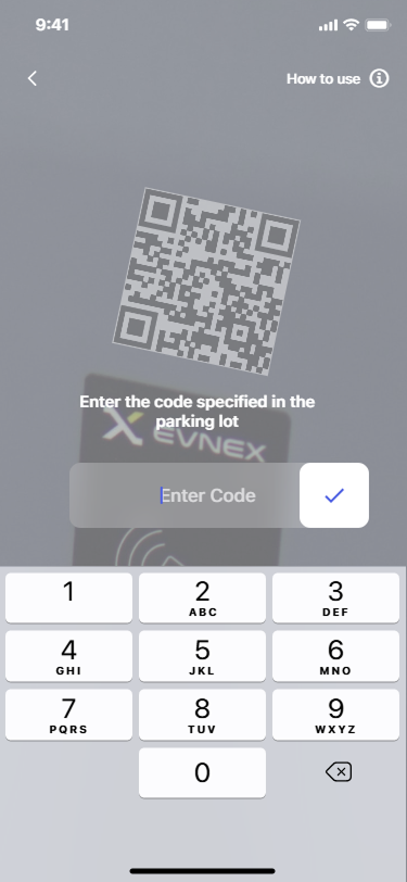
Next, information architecture and detailed user flows were prepared for key use cases such as refuelling and charging. Initial screens were designed using the existing design system, with custom components created where standard elements were insufficient.
An interactive prototype was then built to demonstrate the complete experience. The prototype was presented to the client, feedback was collected, and final adjustments were made before organising the designs for handoff.
Solution
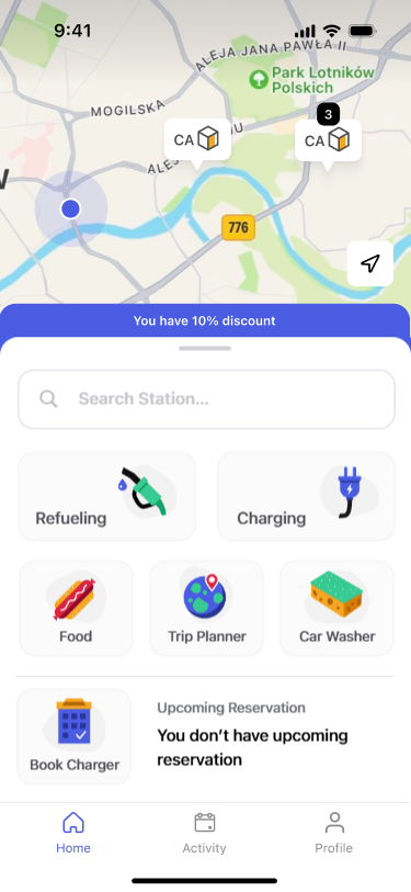
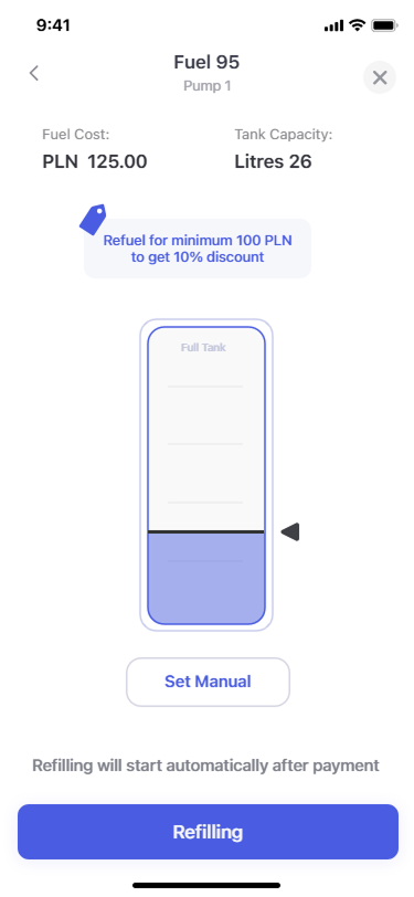
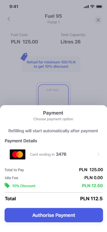
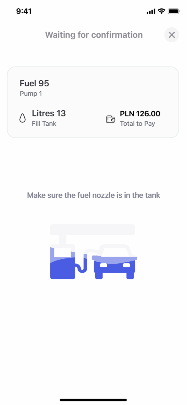
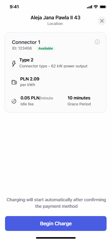
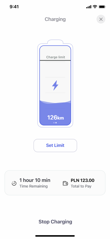
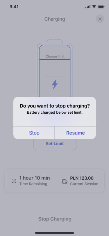
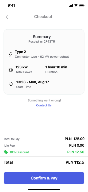
The solution focused on prioritising fuel and charging payments, ensuring that users can access the main functionality immediately after opening the app. The home screen was designed to minimise friction and guide users directly into the payment process.
To enhance the overall travel experience, several additional modules were introduced:
- Trip Planner, allowing electric vehicle users to plan routes and reserve charging stations
- Car Wash Module, enabling payment for both touchless and automatic car washes
- Food Module, allowing users to order and pay for food available at gas stations
By combining these features, the app supports both quick refuelling stops and longer journeys while keeping the core experience simple and focused.
Outcome
Although the project was postponed for future development, the work demonstrated my ability to design complex, feature-rich applications while maintaining usability and clarity. The research, design decisions, and prototype contributed directly to securing a full-time position after the internship, validating the quality and impact of the solution.
Lessons learned and challenges
One of the main challenges was balancing functionality with simplicity to avoid overwhelming users while still delivering meaningful features. Competitor research helped identify common pitfalls, but defining the right feature set required careful prioritisation and close collaboration with stakeholders.
Working within an existing design system while extending it with custom components strengthened my understanding of consistency and scalability. Presenting and refining the prototype based on feedback reinforced the importance of clear communication and iterative design.