Healthcare Insurance Platform
A provider portal for a healthcare insurance and managed care organization, helping care providers process claims, manage prior authorizations, verify eligibility, and access claim-related information.

Problem
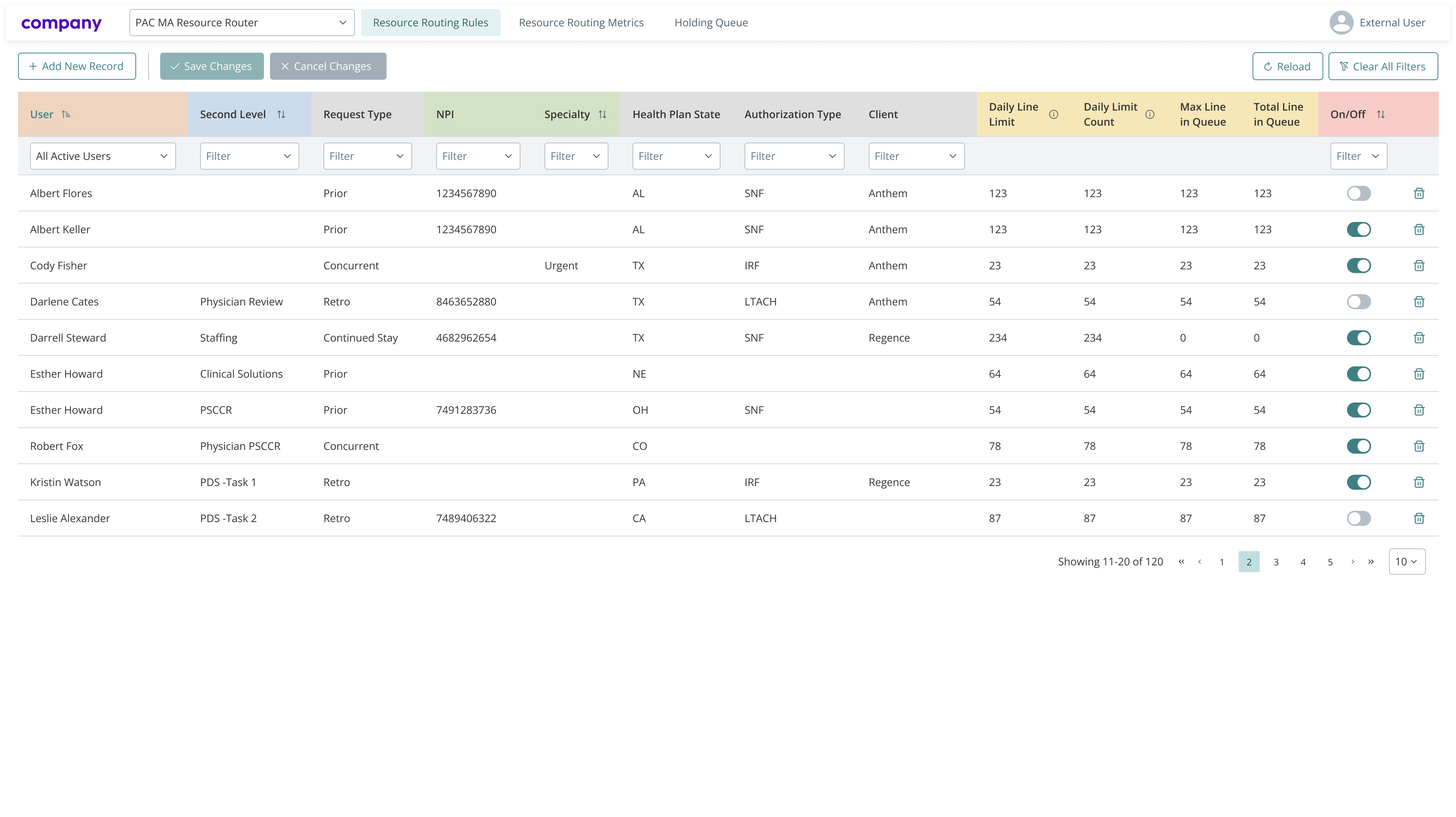
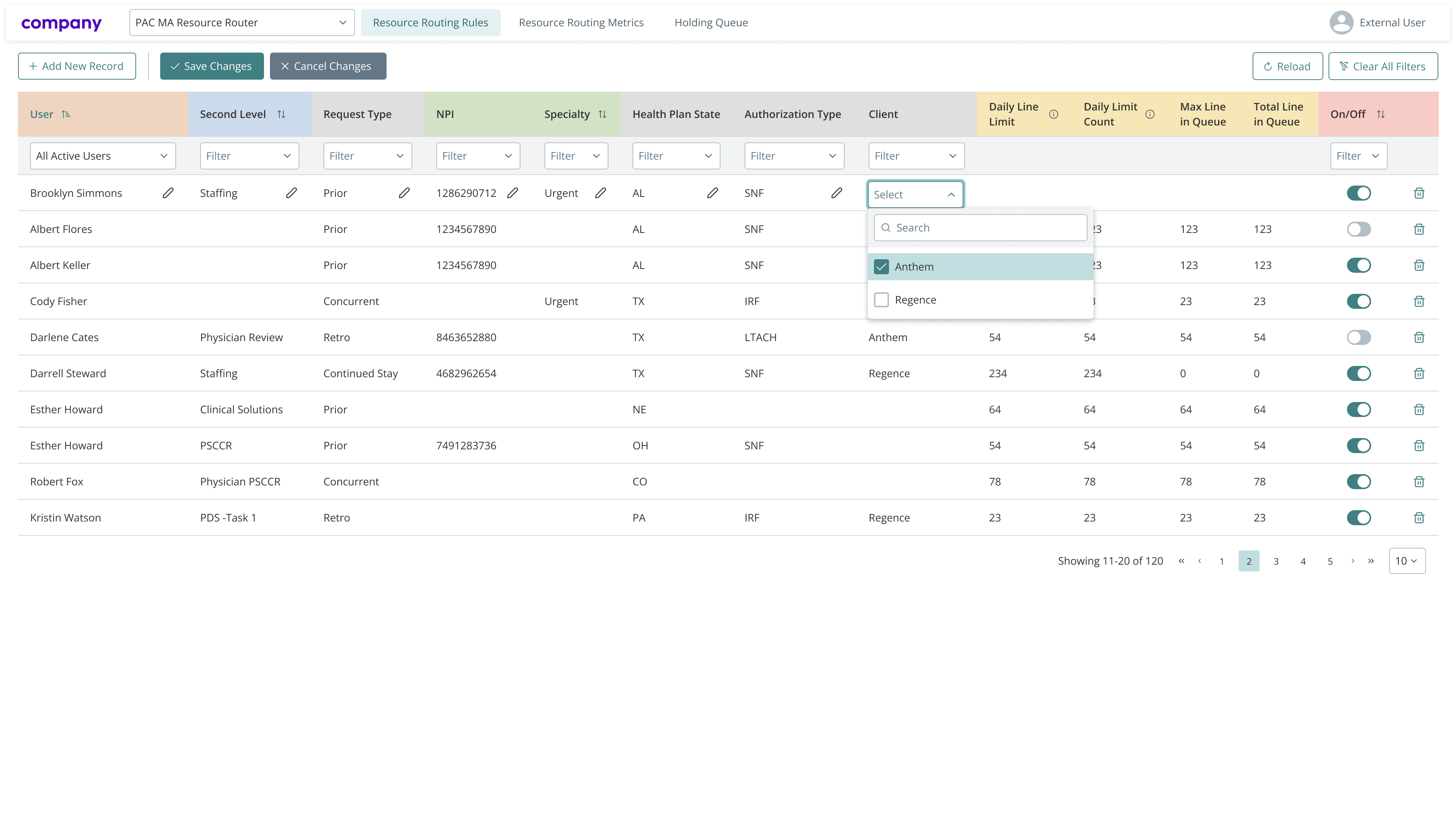
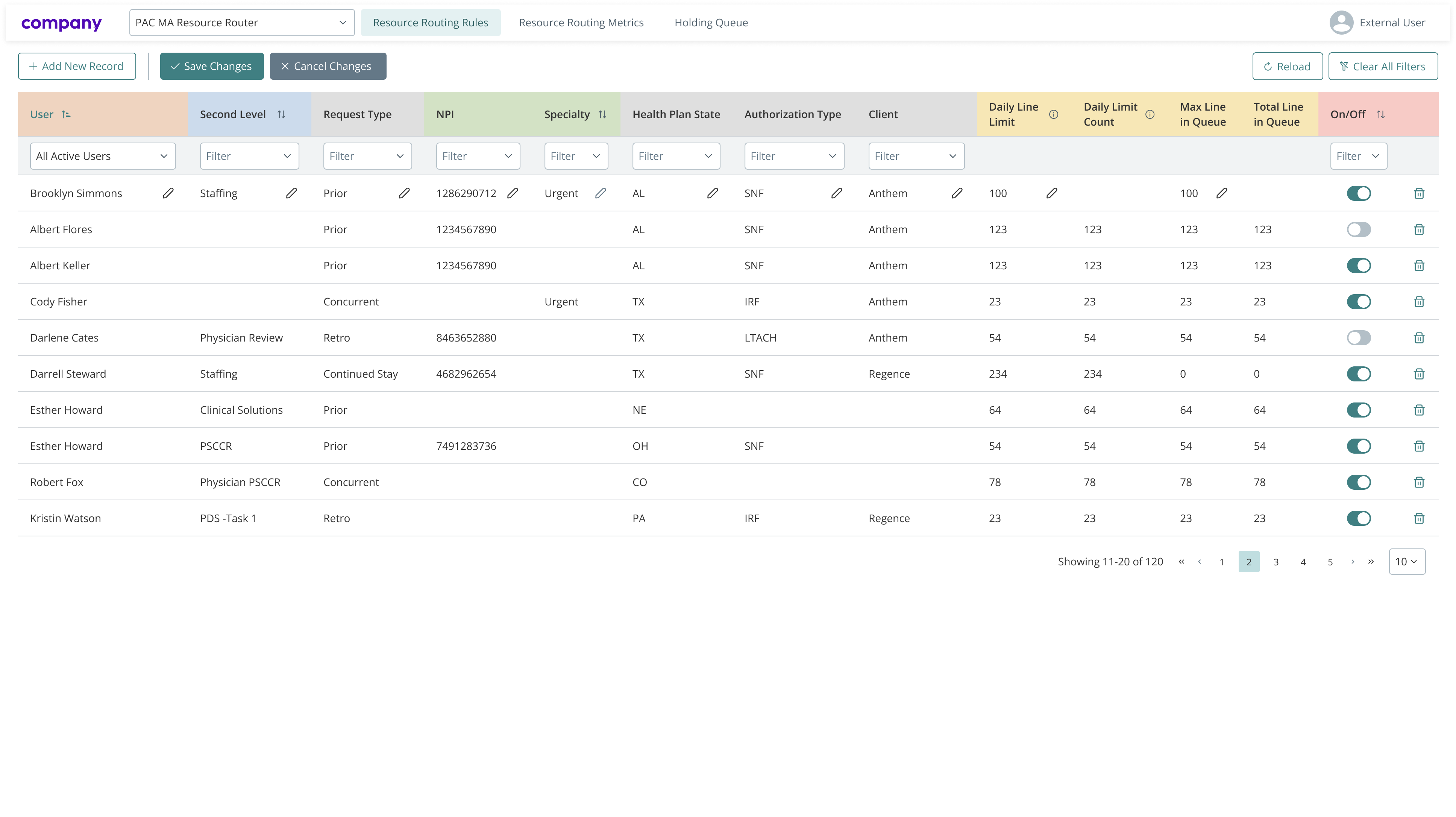
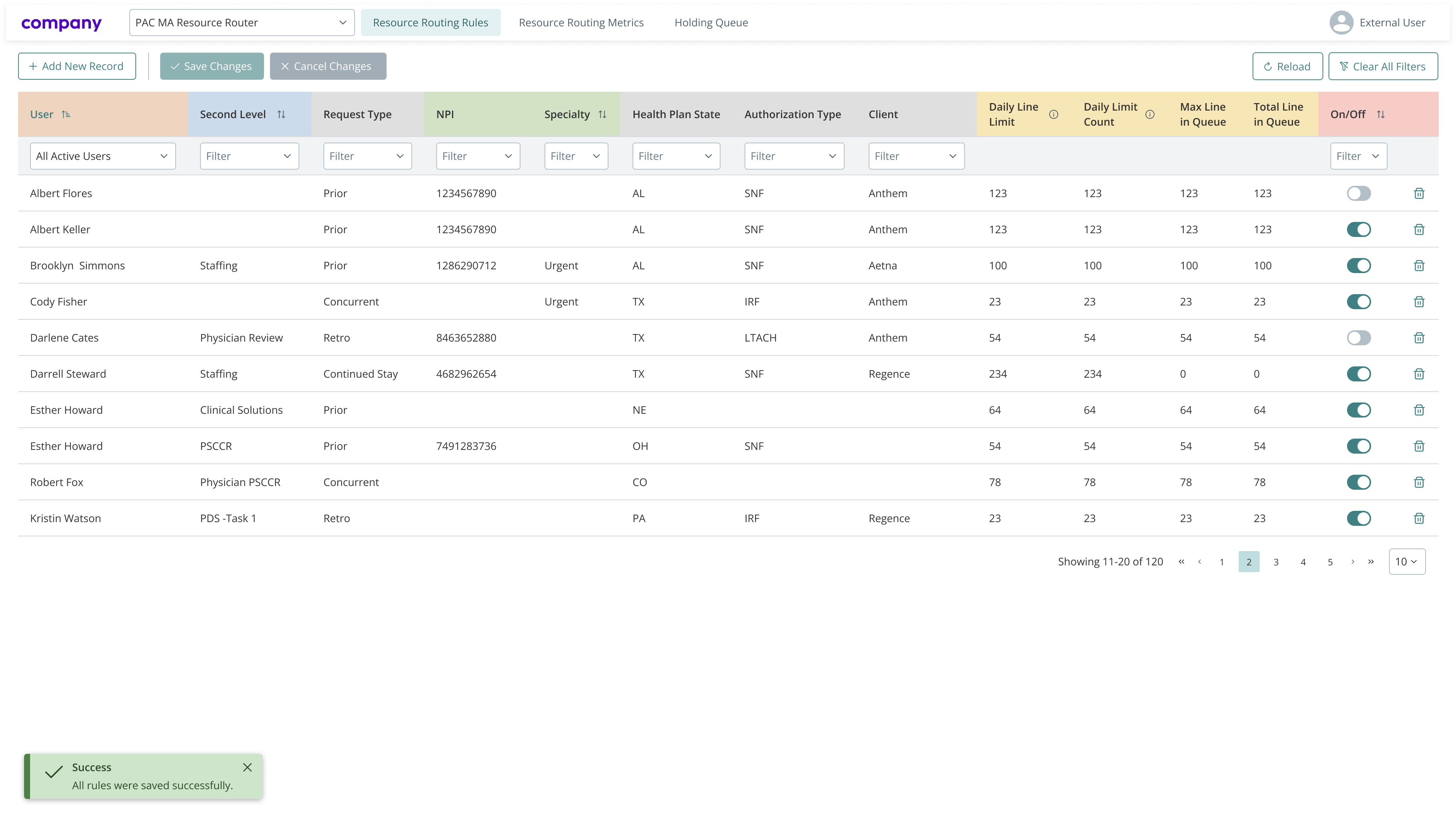
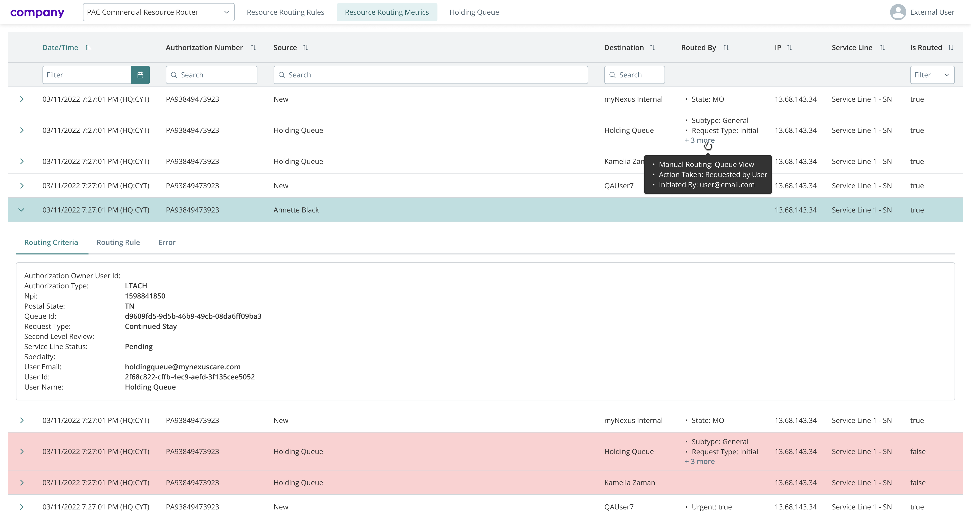
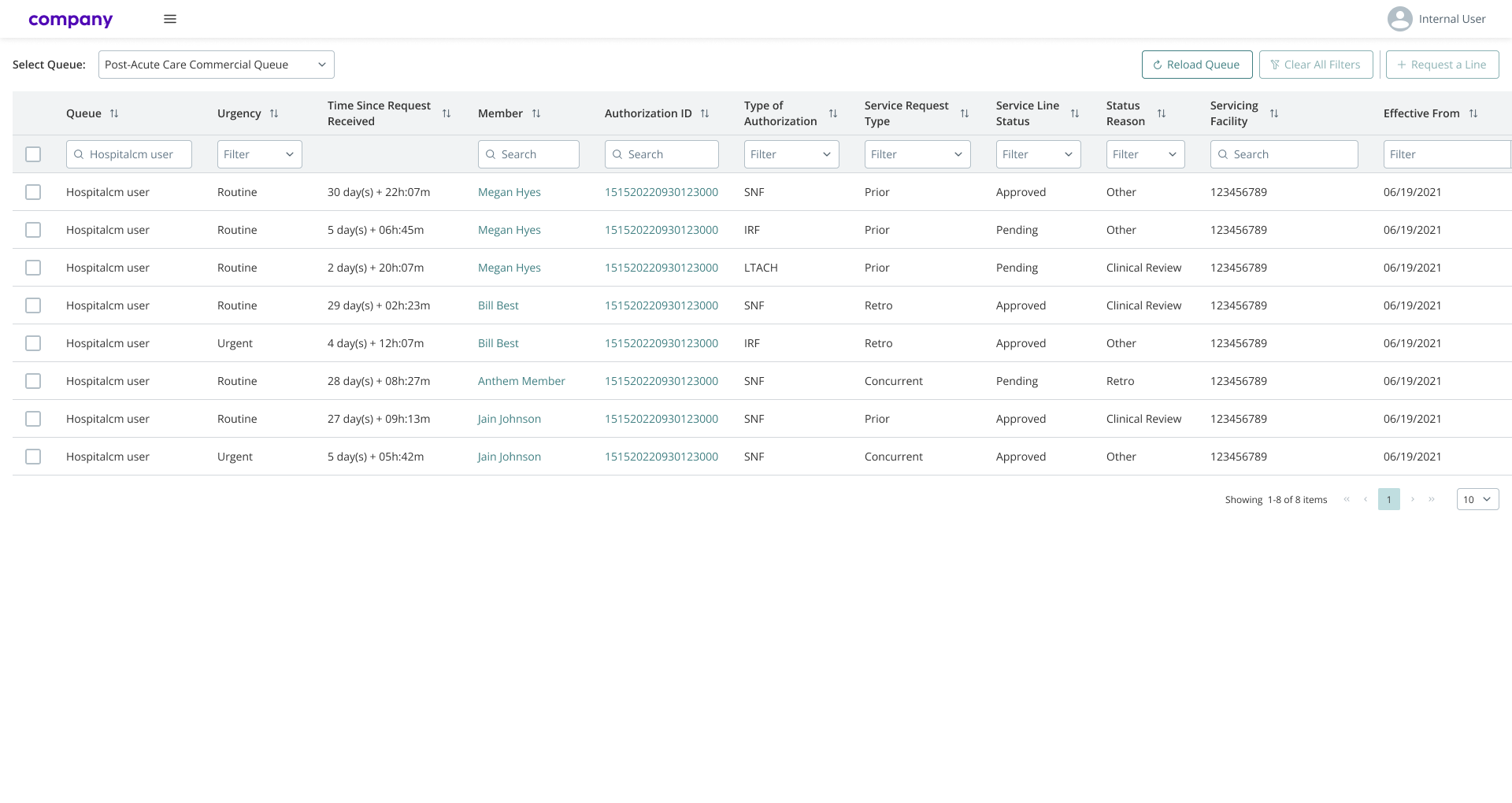
While the platform was already functional, several workflows remained unnecessarily complex and time-consuming. Users often needed to navigate through multiple screens to complete simple tasks, particularly when working with data-heavy tables and sensitive information. Minor usability issues, outdated UI patterns, and missing safeguards slowed down task completion and increased the risk of errors.
My role and responsibilities
I worked as a UX/UI Designer responsible for improving existing workflows and supporting the ongoing development of the platform. My scope included designing user flows and UI mockups, updating and maintaining the design system, conducting UI audits, and preparing guidelines and documentation to support consistent implementation across the product.
Process
My work followed an iterative, delivery-focused process aligned with ongoing product development. Depending on project priorities, I regularly switched between UI audits, design system updates, and feature design.
Each task typically started with a detailed user story provided by the business analyst team. After reviewing requirements and acceptance criteria, I designed user flows to structure the interaction and identify potential edge cases, especially in scenarios involving sensitive data.
Based on these flows, I prepared mockups aligned with the existing design system. Designs were first reviewed with the BA team to validate business logic and completeness. Once approved, they were reviewed again with the development team, where feasibility, technical constraints, and potential improvements were discussed.
After final acceptance, the mockups and guidelines were attached to the user story and passed to development. Once implementation was complete, the feature was tested by the QA team, while I conducted a UI review to ensure visual consistency, accessibility, and alignment with design standards.
Solution
Depending on the specific task, different improvements were introduced to help users complete their work more efficiently. These typically included simplifying interactions within large data tables, reducing unnecessary steps in short task flows, adding security checks when working with sensitive information, and improving accessibility and visual clarity across the interface.
The solutions were designed to adapt dynamically to available data, allowing the same process to remain clear and predictable even when additional steps were required.
Outcome
Feedback from users and stakeholders indicated that the introduced updates improved clarity and efficiency when working with the platform. Development and QA teams also provided positive feedback on the clarity of the guidelines and documentation, which helped streamline implementation and reduce rework.
Lessons learned and challenges
A key challenge was designing workflows that support efficient work with large and complex datasets containing sensitive personal information. Balancing security, compliance, and usability required careful attention to interaction design, validation states, and error prevention. This project reinforced the importance of consistency and clear UX foundations in regulated, data-heavy environments.