Improving Loyalty Management System
A loyalty management platform designed to help businesses build, manage, and optimise loyalty programs across multiple sales and marketing channels. The system enables the collection and use of zero- and first-party data to create personalised promotions, supports gamification mechanics, and provides flexible tools for rewarding customers through monetary, experiential, and emotional incentives.
Problem
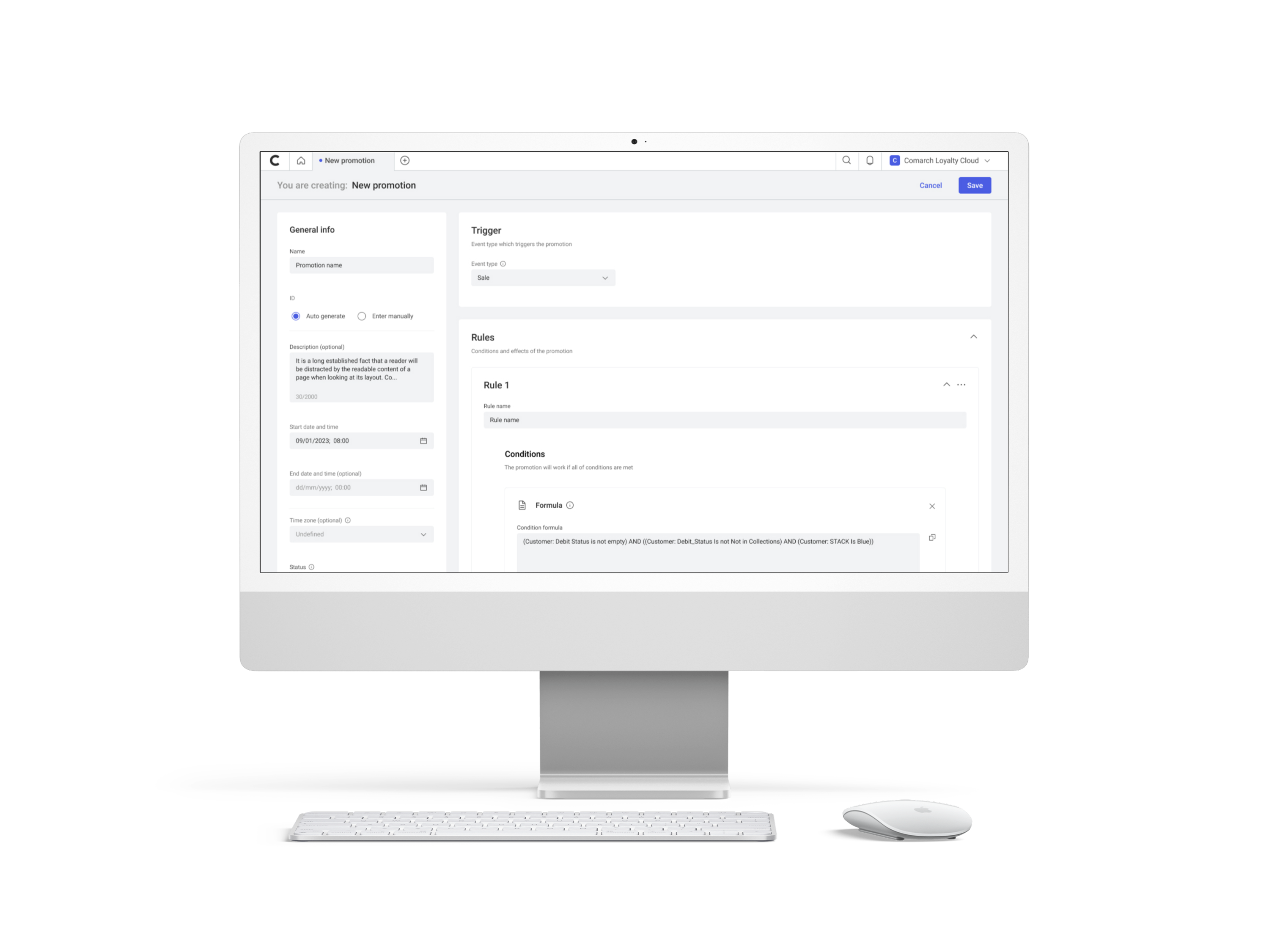
Loyalty management systems are inherently complex and require a deep understanding of both business rules and technical constraints. For new users in particular, setting up promotions and marketing rules was time-consuming and difficult, often requiring assistance from more experienced team members. The process of defining promotion logic lacked clarity and made it easy to introduce errors.
My role and responsibilities
As one of the UX/UI designers on the project, I was responsible for conducting user research with active system users, benchmarking competitive solutions, designing and iterating on user interfaces, and refining concepts in close collaboration with analysts and developers. I also prepared interactive prototypes and presented solutions to potential users and sales consultants to gather early feedback.
Process
The work started with a detailed review of analysis and business documentation prepared by the analyst team. This provided a clear understanding of existing system capabilities and constraints. In parallel, meetings with current users were conducted to identify pain points, workflows, and areas that required simplification.
Based on gathered insights, competitive benchmarking was performed to understand how similar problems were addressed in other tools. Initial design concepts were then created and reviewed collaboratively with analysts and developers. Through multiple iterations, the designs were refined to balance flexibility with usability.


Once the concepts reached a stable state, interactive prototypes were prepared and presented to potential users and sales consultants. Their feedback helped identify remaining usability issues and improve clarity. After final alignment with the Product Owner and analysts, the designs were handed over to the development team.
Solution
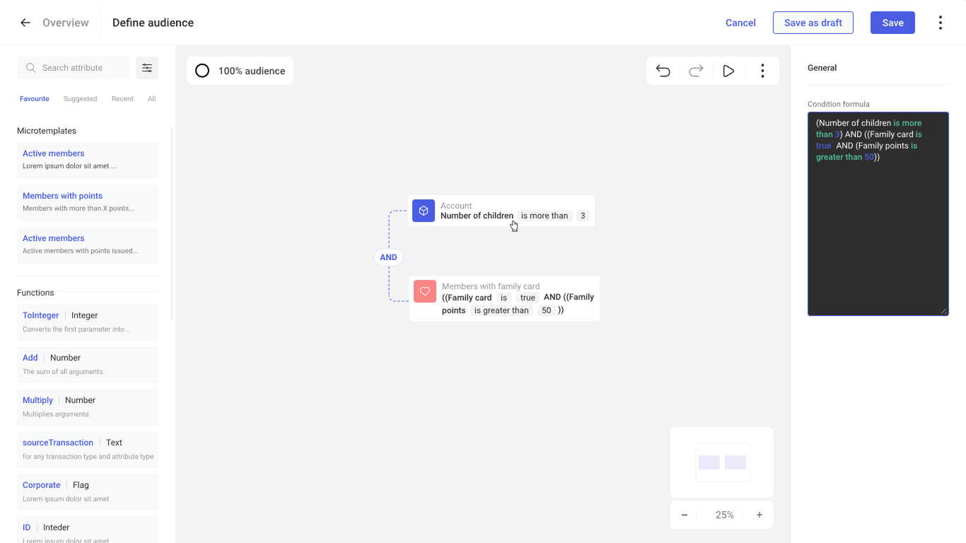
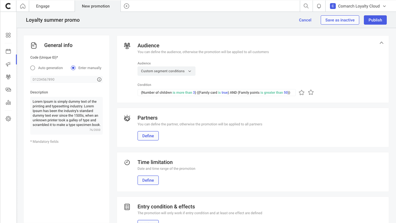
To simplify the process of defining promotions, a new module was introduced that allows users to visually build formulas using predefined templates. Each template is tailored to a specific promotion type, helping users start with a clear structure while still allowing customisation to meet individual business needs.
In addition to the rule builder, the main dashboard was redesigned to improve readability and navigation. A clearer layout, stronger visual hierarchy, and better organisation of key elements made it easier for users to understand system status and manage promotions efficiently. The updated interface reduced cognitive load and shortened the time needed to complete recurring tasks.


Outcome
Feedback from internal users confirmed that the new module significantly simplified the process of defining promotions. Users were able to create and modify marketing rules faster and with fewer errors. The redesigned dashboard improved overall readability and navigation, making daily work with the system more efficient and predictable.
Lessons learned and challenges
One of the main challenges was designing a solution that remained flexible enough for advanced use cases while still being accessible to less experienced users. Achieving this balance required multiple iterations and continuous validation with stakeholders.
Redesigning the dashboard reinforced the importance of user feedback in shaping information hierarchy and layout decisions. Small structural improvements had a noticeable impact on usability and task completion time.